I created a user flow for two different scenarios when using the app, as these address the main user needs.
User Flow 1: Create a new savings goal and share it with your partner.
User Flow 2: Use the app to quickly and easily add to a shared savings goal.

Key elements to feature in the paper wireframes:
The key takeaway I found, was to look into the best way to display the goal visually, either as a horizontal bar graph, vertical bar graph or circle graph. The horizontal bar graph takes up the least space, while the circle graph is visually appealing – will look into letting users select which graph option they prefer in settings.
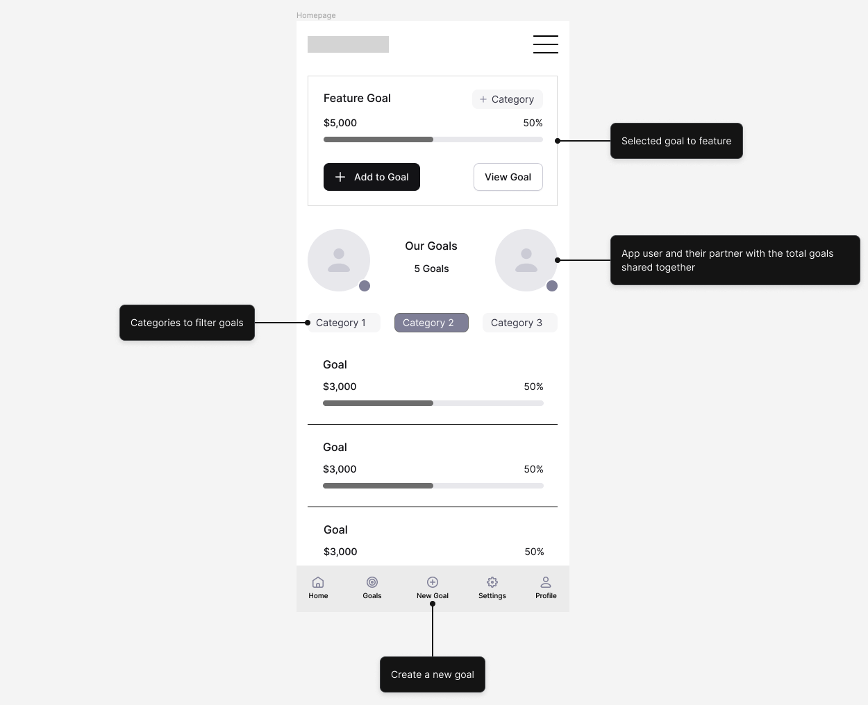
Homepage wireframe refining elements from the paper wireframes.
Includes:

First low-fidelity prototype interaction, showing flow to View Goal, Create a New Goal, Add to the Goal from the homepage and the Goal page.